
Ever wondered why your product photos seem off compared to the real thing? You’ve taken what you thought was the perfect shot, but the colors look all wrong when you view the image on your screen. This is a common problem many e-commerce sellers face. If it’s the lighting, camera settings, or screen calibration, your product images may not always reflect what you see in real life.
Accurate color representation is crucial for your e-commerce business. When your product photos are true to life, they build trust with customers, reduce returns, and ultimately help you increase sales. In this guide, we’ll walk you through the steps to achieve perfect product photos through proper color correction.
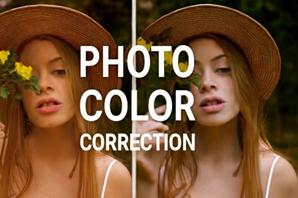
What Is Photo Color Correction?
Photo color correction is the process of adjusting the colors in an image to match the real-life product as closely as possible. This involves tweaking elements like the white balance, exposure, saturation, and contrast to ensure the colors are accurate and vibrant. Unlike color grading, which is used for artistic effects, color correction aims to restore the product’s true colors.
Color correction is essential in e-commerce because accurate product photos ensure that customers know exactly what they’re buying. This not only builds trust but also helps you avoid disappointing customers who may receive products that don’t match their expectations.
How to Achieve Accurate Colors in Your Product Photos
To get accurate colors, there are a few steps you need to follow. Let’s break it down:
1. Adjust Your White Balance
White balance helps eliminate any color casts caused by the lighting in your photo. The correct white balance ensures that the whites in your image appear truly white, not tinted by the light source. This is the first step in ensuring accurate color correction.
- Tip: In tools like Adobe Lightroom or Photoshop, use the eyedropper tool to sample the color of something neutral in your photo, like a gray card, to set the white balance.
2. Fix Exposure and Contrast
Exposure affects how light or dark your photo is, while contrast helps define the difference between light and dark areas. Ensuring proper exposure and contrast helps your product’s details pop, making the colors look clearer and more accurate.
- Tip: Adjust the exposure slider to brighten or darken your image and use the contrast slider to make your product stand out without losing detail.
3. Saturation and Vibrancy
While saturation increases the intensity of all colors, vibrancy only enhances the less-saturated colors in your photo, ensuring the product doesn’t appear too artificial.
- Tip: Use vibrancy adjustments over saturation to enhance the image without overdoing it.
4. The Impact of Lighting on Color Accuracy
Lighting is one of the most significant factors influencing how colors are rendered in photos. Natural light tends to offer a more accurate color balance, but artificial lighting can introduce color shifts if not handled properly.
Lighting Types
- Natural Light: When shooting indoors, using daylight (or soft, diffused sunlight) provides the best color accuracy.
- Artificial Light: Incandescent or tungsten bulbs often create a yellow tint, while fluorescent lighting can produce a greenish hue. Consider using white balance adjustments or daylight bulbs to avoid these issues.
Lighting Setup Tips
- Use diffusers to soften the light and reduce harsh shadows.
- Position your product at a 45-degree angle to the light source to avoid direct reflection, which can distort colors.
5. How to Handle Different Backgrounds and Their Color Effects
The background color of your product photo plays a significant role in how the product’s colors are perceived. If your background is too similar in tone to your product, it may affect the overall color balance.
Background Color Tips
- Use neutral-colored backgrounds (e.g., white or light gray) to prevent background colors from influencing your product’s color.
- Avoid distracting or bright backgrounds that might compete with the product’s color.
Correction Tips
- If the product color is blending with the background, use selective color adjustments in your editing tool to make the product stand out.
Understanding Color Profiles and Their Role in Photo Correction
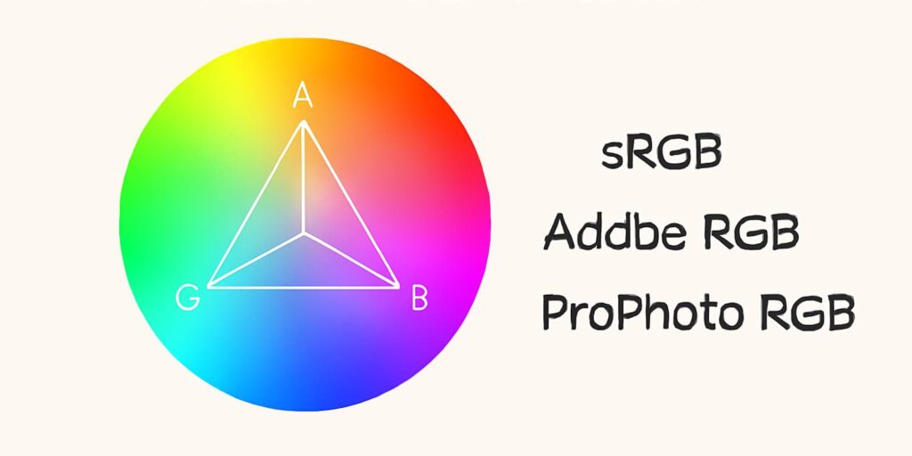
When product photo editing, it’s essential to choose the right color profile to ensure that the colors appear correctly on different screens. Profiles like sRGB, AdobeRGB, or ProPhoto RGB determine how colors are interpreted across devices.
Choosing the Right Color Profile
- sRGB is ideal for images displayed on the web, as it’s the most widely supported color space.
- AdobeRGB is preferred for high-quality print production and offers a wider color range than sRGB.
Why It Matters
Without the right color profile, the colors in your product photos may look different on various devices. This can lead to discrepancies that may affect how customers perceive your product.
Common Mistakes in Product Photo Color Correction
While correcting colors, it’s easy to make some common mistakes. Let’s cover a few:
1. Over-saturation
Increasing saturation can make colors pop, but too much can make the product look unnatural. Subtle adjustments are key here.
2. Ignoring Lighting
Different light sources can affect how the colors appear. Always check your white balance to adjust for different lighting conditions.
3. Inconsistent Edits
If you’re editing multiple product photos, inconsistency can make your brand look unprofessional. Stick to the same settings and adjustments across all images to maintain consistency.
4. Incorrect White Balance
An improper white balance can give your product a weird tint, affecting its true color. Always calibrate your white balance before product photo editing.
Practical Tips for Effective Color Correction
1. Use Gray Cards for Accurate White Balance
A gray card is a neutral reference that ensures accurate color correction by providing a standard for white balance calibration.
2. Calibrate Your Monitor
Without a properly calibrated monitor, the colors you see during editing may not match what others see on their screens. Use tools like a monitor calibrator to ensure color accuracy.
3. Follow a Consistent Editing Workflow
Create a workflow for color correction that you follow consistently. Start by adjusting white balance, then exposure, contrast, and saturation. This ensures that each photo maintains consistency and color accuracy.
Advanced Techniques for Professional Results
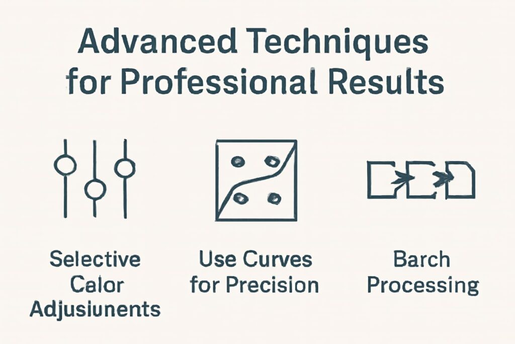
If you’re looking to take your photo color correction skills to the next level, consider these advanced techniques:
1. Selective Color Adjustments
Using tools like the HSL sliders in Lightroom, you can adjust specific colors in the image (like making reds more vibrant) without affecting the rest of the photo.
2. Use Curves for Precision
The Curves tool allows you to adjust brightness and contrast in specific tonal ranges (shadows, midtones, and highlights), giving you more control over the image.
3. Batch Processing
If you have many images to edit, batch processing can save time by applying the same corrections to multiple images at once. Both Lightroom and Photoshop have batch processing features.
Why Color Correction is Essential for E-commerce Photo Editing
Accurate Product Representation: Ensures product colors match what customers will receive, reducing returns and increasing customer satisfaction.
Enhanced Visual Appeal: Improves vibrancy and clarity, making product images more attractive and engaging to potential buyers.
Consistency Across Images: Guarantees uniformity in product photos, maintaining a professional and cohesive brand identity.
Device Optimization: Adjusts images to look great on various devices, ensuring consistency across desktops, mobile phones, and tablets.
Improved Conversion Rates: Accurate colors boost customer confidence, leading to higher purchase rates and fewer returns.
Brand Differentiation: Professionally color-corrected images help set your brand apart, portraying it as high-quality and trustworthy.
Using AI and Machine Learning for Color Correction
AI-powered tools like Luminar AI use machine learning to automatically detect color imbalances and correct them. These tools save time while ensuring your images are accurate.
While AI tools can assist in color correction, always ensure you check the final result to ensure it aligns with your brand’s aesthetics and product standards.
Tools and Resources for Color Correction
Here are some of the best tools and resources for photo color correction:
- Adobe Lightroom & Photoshop: The industry-standard for professional photo editing.
- GIMP: A free alternative to Photoshop for color correction.
- Luminar AI: An AI-powered tool for automatic photo correction.
For further learning, check out tutorials and forums like PetaPixel and Fstoppers for in-depth guides on color correction.
Conclusion
In conclusion, accurate photo color correction is essential for making your product photos look true to life, building trust with your customers, and boosting your sales. By following the tips and techniques outlined above, you’ll be able to take your product photos to the next level and provide a great visual experience for your customers.
Ready to improve your product photos? Start implementing these color correction techniques today for better results! For professional edits contact with the Photo Edit Up team.
FAQ
1. How do I fix a photo that looks too blue or yellow?
Adjust the white balance in your editing software to neutralize the color cast.
2. What is the best tool for product photo color correction?
Adobe Lightroom is the most popular tool, but GIMP is a great free alternative.
3. Why does my product image look different on mobile?
It could be due to differences in color profiles or screen calibration. Ensure you use sRGB for web photos.